
Why strategic color choices aren’t just trends — they’re cultural signals that connect brands to what audiences already feel.
Here’s a question we hear often from clients: “Should we follow color trends, or will that make our brand look dated in two years?”
It’s the wrong question.
The right question is: “Are we choosing colors strategically — based on the emotions and cultural moments our audience is living through right now?”
When color choices are strategic (not just trendy), they do something powerful: they signal that your brand gets the mood of the moment. That you’re speaking the same visual language your audience is already drawn to.
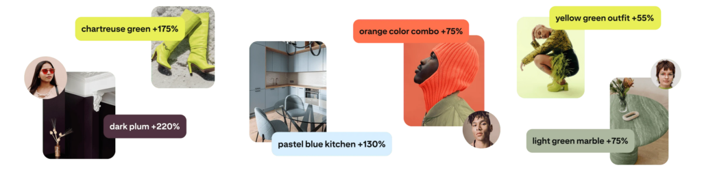
In early 2026, Pinterest unveiled its annual Pinterest Palette — five trend-driven hues expected to shape aesthetics and consumer behavior throughout the year. Derived from billions of user searches and saves, this forecast isn’t arbitrary. It’s a data-rich snapshot of the moods, identities, and stories people are gravitating toward right now.
The shades identified include:
- Cool Blue – a frosty, refreshing blue signaling clarity and calm
- Jade – an earthy green blending serenity with sophistication
- Plum Noir – a rich, moody purple with depth and mystery
- Wasabi – an electric chartreuse green that demands attention
- Persimmon – a joy-infused red-orange packed with energy
Here’s what made us pause: many of our agency’s rebrand projects from 2025 naturally reflected these exact color trends — even before Pinterest officially forecasted them for 2026.
That’s not coincidence. It’s what happens when brand strategy is rooted in cultural insight, not just aesthetic preference.
Why Color Matters More Than You Think
Color isn’t decoration. It’s communication.
Before a single word is read, color signals mood, positioning, and credibility. For consumers whose browsing behavior is increasingly visual (Instagram, Pinterest, TikTok), that first impression can determine whether they stop scrolling — or keep moving.
These trending hues reflect real emotional shifts:
- Persimmon’s joyful warmth speaks to confidence and social optimism
- Cool Blue’s clarity aligns with a desire for focus in a noisy digital world
- Wasabi’s electric punch captures bold self-expression and individuality
Understanding these cultural cues helps brands connect more authentically with audiences. Not because they’re “on trend” — but because they’re tapping into what people already feel and want to express.
How Our 2025 Brand Work Already Reflected These Signals
When we look back at the rebrands and brand evolutions we completed in 2025, we see these same colors showing up — not because we were chasing trends, but because we were solving for the same cultural moments Pinterest’s data now confirms.
Here’s how strategic color choices aligned our clients’ brands with the signals their audiences were already responding to:
Cool Blue — Strategic Calm and Clarity
The Cultural Signal: In an era of digital overwhelm and constant connectivity, people are craving clarity, focus, and calm. Cool Blue represents that desire for mental space and trustworthy simplicity.
Our 2025 Brand Work: For tech and wellness clients who needed to project reliability without feeling cold or clinical, we leaned into soothing blues in identity systems and UI treatments. These weren’t trend-chasing choices — they were strategic responses to audience needs for composure and trust in categories where credibility matters.
Brand Takeaway: Cool tones express stability and forward-thinking sophistication, especially for brands where trust and clarity are non-negotiable.
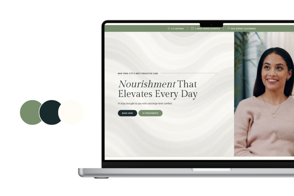
Jade — Nature Meets Elegance
The Cultural Signal: Sustainability isn’t just functional anymore — it’s aspirational. Jade captures the shift from “eco-friendly equals basic” to “sustainability meets sophistication.” It’s nature-inspired without feeling crunchy.
Our 2025 Brand Work: In fashion, lifestyle, and eco-conscious product brands, earthy green accents helped signal both environmental values and elevated quality. This balance was critical for clients who wanted to appeal to conscious consumers without sacrificing premium positioning.
Brand Takeaway: Earth tones rooted in nature feel both timeless and current — ideal for brands emphasizing authenticity without compromising on aesthetic ambition.
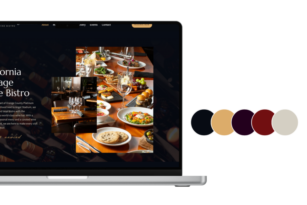
Plum Noir — Depth, Drama, and Luxury
The Cultural Signal: As consumers seek more meaningful, emotionally rich experiences, deeper, moodier tones signal substance over surface. Plum Noir represents mystery, sophistication, and elevated taste.
Our 2025 Brand Work: Luxury and personal-care brands in our portfolio embraced deeper purples and burgundy-toned accents months before Pinterest highlighted Plum Noir. These hues helped convey richness and an elevated aesthetic that resonated with premium positioning — signaling “this is for people who appreciate craft and quality.”
Brand Takeaway: Dark, expressive tones elevate perceived value when applied with intentionality. They work especially well for brands that want to signal depth, not just brightness.
Wasabi — Bold, Electric, and Unapologetic
The Cultural Signal: This isn’t your neutral, safe green. Wasabi is electric, attention-grabbing, and unafraid. It speaks to audiences who want to stand out, not blend in — particularly Gen Z consumers who value individuality and self-expression.
Our 2025 Brand Work: For brands targeting younger, more expressive audiences, we used electric greens and chartreuse as strategic accent colors in packaging and social visuals. These weren’t decorative choices — they were calculated decisions to increase memorability and visual disruption in crowded digital feeds.
Brand Takeaway: High-voltage accent colors increase brand recall and signal confidence. Use them when you want to be remembered, not just seen.

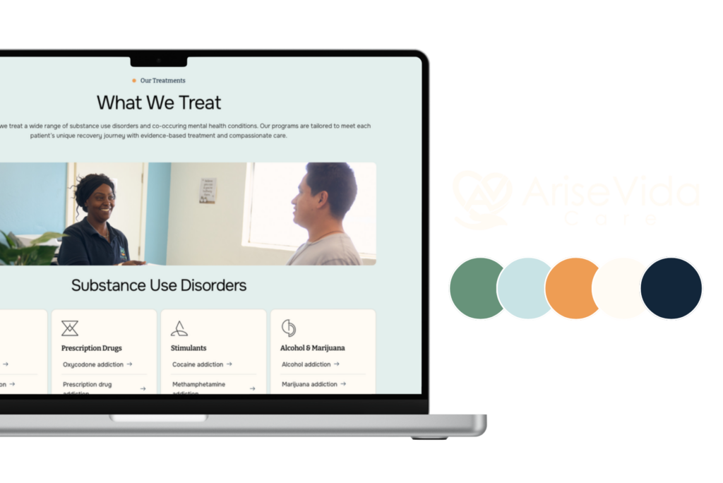
Persimmon — Joy, Energy, and Social Connection
The Cultural Signal: After years of muted palettes and “sad beige,” there’s a cultural pendulum swing toward warmth, optimism, and human connection. Persimmon captures that joyful, energetic mood — it’s approachable, social, and alive.
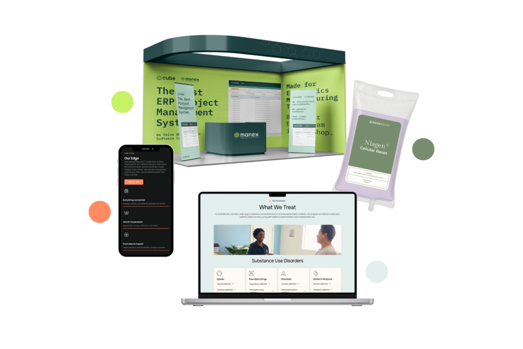
Our 2025 Brand Work: Vibrant red-oranges appeared in several of our 2025 projects — whether as primary brand colors for lifestyle brands or as bold accents in campaign assets. For Manex, a 30-year-old B2B software company, strategic pops of warm orange helped modernize the brand and signal approachability without sacrificing credibility. The color choice balanced “we’re established and trustworthy” with “we’re energized and forward-thinking.”
Brand Takeaway: Warm, energetic tones can humanize technical or traditional brands. They signal optimism and accessibility while maintaining professionalism.

The Pattern: Strategy First, Trends Follow
Here’s what these examples reveal: we weren’t following Pinterest’s trends. We were responding to the same cultural shifts Pinterest’s data confirms.
When color choices are strategic — rooted in audience psychology, cultural context, and brand positioning — they naturally align with broader movements. That’s not luck. That’s what happens when brand decisions are informed by insight, not just aesthetics.
The brands we worked with in 2025 don’t look trendy. They look current — because their color choices reflect the emotional landscape their audiences are already living in.
Looking Ahead: Our 2026 Color Predictions
So what’s next?
Based on emerging Gen Z consumer behaviors, social media aesthetics, and cultural shifts we’re tracking across fashion, tech, beauty, and lifestyle, here’s our forward-looking palette for 2026:
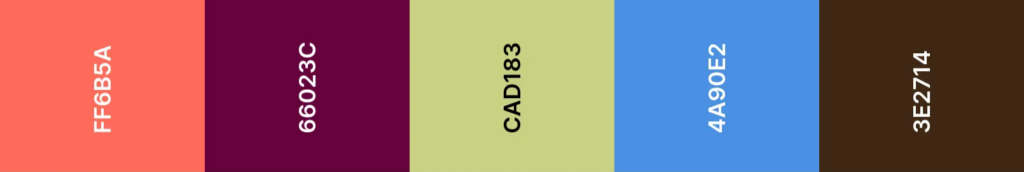
Guava Glow — #FF6B5A A vibrant, tropical coral that radiates optimism and aspiration. This color captures the return of travel culture, the pursuit of joy, and the desire for brands that feel fresh and alive. Perfect for lifestyle brands, hospitality, wellness, and any brand that wants to signal energy and approachability without feeling childish.
Cashmere Violet — #66023C A deep, luxurious purple-burgundy that signals sophistication and moody elegance. Inspired by high-fashion textiles, premium cosmetics, and luxury event design, this shade appeals to consumers seeking emotional depth and tactile quality. Ideal for beauty brands, fashion, premium services, and brands that want to convey substance with drama.
Matcha Latte — #CAD183 A warm, creamy green that balances wellness with indulgence. This isn’t your typical forest green — it’s Instagram-friendly, approachable, and speaks to the ongoing sustainability movement without feeling preachy. Perfect for food & beverage, eco-conscious brands, and lifestyle products that want to feel both healthy and aspirational.
Sapphire Pulse — #4A90E2 A bright, luminous blue that captures the energy of AI and modern tech innovation. This isn’t corporate blue — it’s intelligent, forward-thinking, and optimized for digital interfaces. Ideal for tech startups, SaaS platforms, fintech, and any brand positioning itself at the intersection of innovation and human-centered design.
Cocoa Luxe — #3E2714 A rich, warm brown signaling craftsmanship, authenticity, and grounded luxury. This is the antidote to sterile minimalism — tactile, earthy, and elevated. Perfect for artisanal brands, premium food & beverage, heritage companies, and brands that want to convey substance and timeless quality.
Why These Colors for 2026?
These predictions aren’t arbitrary. They’re based on observable shifts across multiple industries:
- Joy & Aspiration Over Anxiety: Guava Glow reflects the cultural pendulum swing toward optimism, travel, and experiences after years of muted palettes and cautious positioning
- Emotional Depth in Fashion & Beauty: Cashmere Violet taps into the desire for richness, drama, and moody sophistication — moving beyond clean-girl aesthetics toward more complex emotional expression
- Elevated Wellness: Matcha Latte represents sustainability that feels premium and lifestyle-forward, not earnest or basic
- Human-Centered Tech: Sapphire Pulse captures AI and tech innovation that feels intelligent but approachable — optimized for digital experiences without feeling cold or corporate
- Grounded Luxury & Craft: Cocoa Luxe reflects the move away from sterile minimalism toward warmer, more tactile materialism — brands that value substance, craft, and authenticity
What This Means for Your Brand
If you’re considering a rebrand or visual refresh in 2026-2026, here’s what matters:
Don’t chase trends. Understand the cultural signals behind them.
Ask yourself:
- What emotional state is our audience in right now?
- What do they value? What are they moving toward or away from?
- How can color help us signal that we understand their world?
When color choices are strategic — informed by these questions, not just trend reports — they create brands that feel current without feeling dated. They connect with audiences on a subconscious level, before a single word is read.
That’s the difference between following trends and leading with insight.
Ready to explore how strategic color can strengthen your brand? Let’s talk about where your brand is headed — and what signals will help you get there.
Get in touch


