What’s Evolving: The New Visual Vocabulary
Design in 2026 feels alive, tactile, and empathetic — moving beyond sterile perfection into spaces that feel crafted, intuitive, and real.
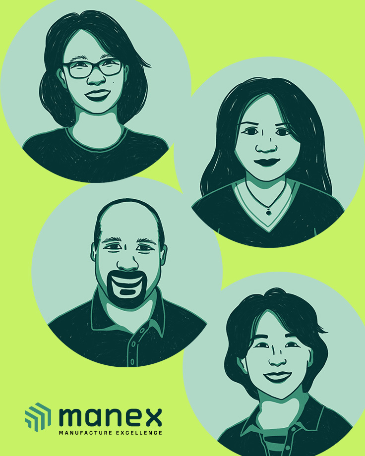
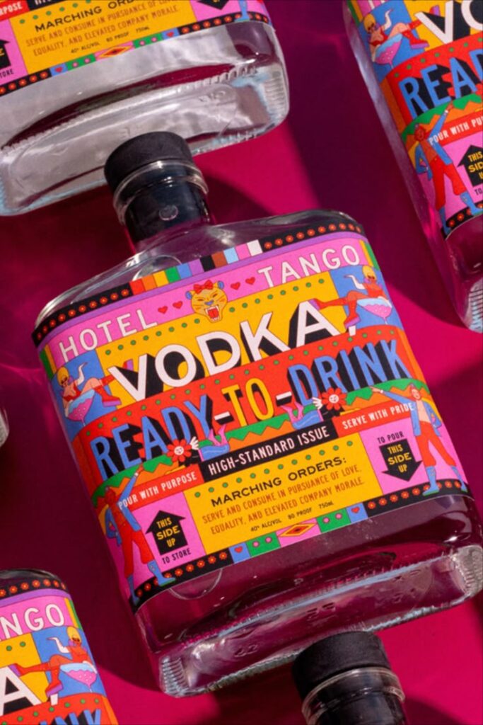
1. Organic, Imperfect Expression
Gone are the days when everything had to feel polished. In 2026, designers are embracing:
- Hand‑drawn textures and imperfect shapes
- Brush strokes, grain, and analog feels
- Illustrations that look like they were made by people, not machines
This trend reflects a broader hunger for authenticity and personality — especially in a digital landscape saturated with flat, template‑like visuals.
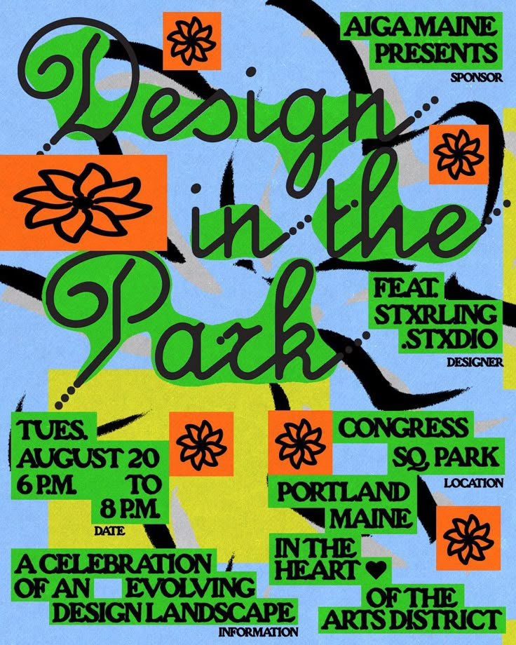
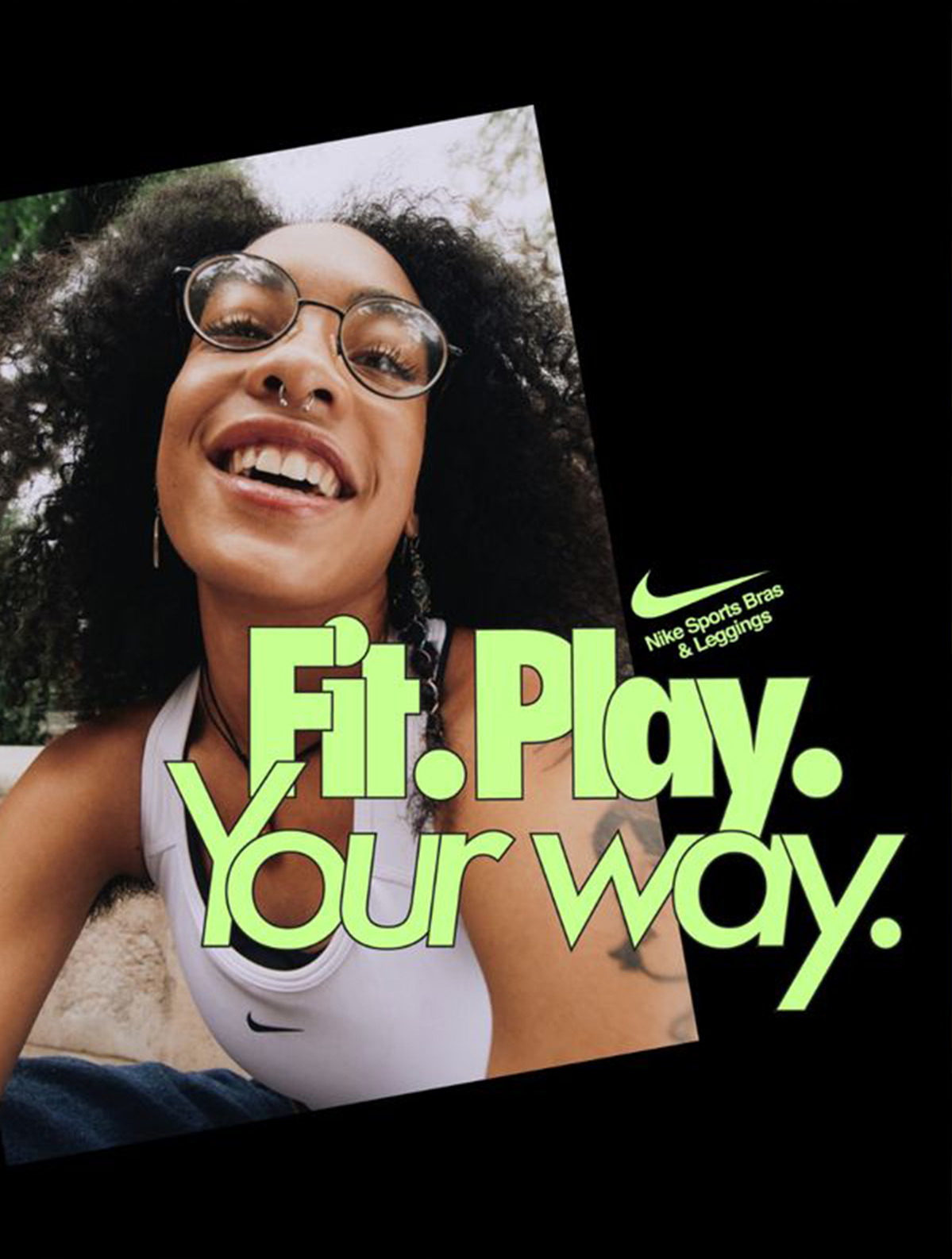
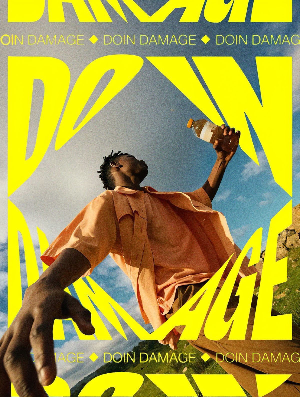
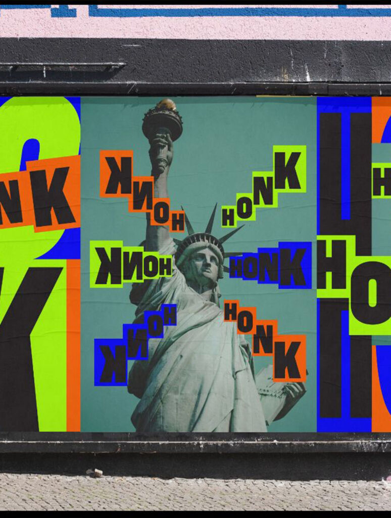
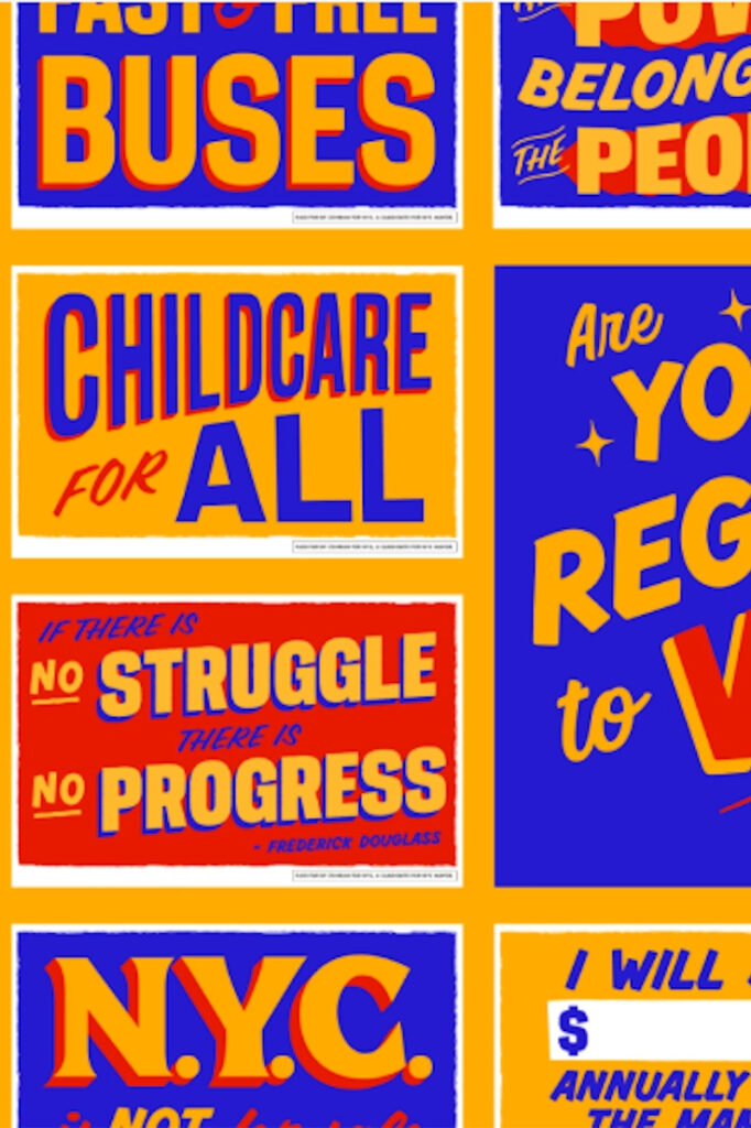
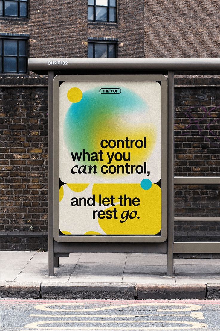
2. Bold, Playful Typography
Typography is no longer just “content” — it’s character. Expect:
- Oversized headlines that set emotional tone
- Characters that feel kinetic, quirky, or expressive
- Type that interacts with imagery rather than just sits beside it
Good typography in 2026 doesn’t whisper — it converses.
3. Sensory & Motion‑Forward Experiences
Static design still matters — but motion is its heartbeat. We’re seeing:
- Micro‑interactions that surprise and delight
- Scroll effects that feel like choreography
- Transitions that guide attention without distraction
Movement isn’t decoration — it’s communication.
(This mirrors how platforms and devices expect richer interaction — audiences now anticipate motion as part of design, not an add‑on.)
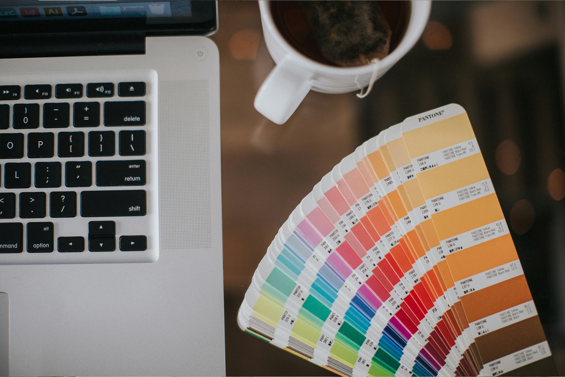
4. Color with Emotion
Muted palettes are giving way to emotive color stories:
- Warm gradients that feel like sunset light
- Unexpected contrasts that provoke attention
- Color as tone, not just brand signal
This isn’t loud for attention — it’s loud for feeling.
What’s Enduring: Design Essentials That Still Matter
Some principles aren’t trends — they’re foundations. In 2026, these are the design constants that help trends land with impact:
Clarity & Purpose
No matter how experimental visuals get, great design must always:
- Communicate clearly
- Guide users easily
- Serve a purpose — not just style
Playful or bold design that confuses is costly, not creative.
Consistency Across Channels
Whether it’s your website, social, email, or ads:
- Cohesive visuals build trust and recall
- Shared systems reduce friction for internal teams
- Followers experience a unified voice and experience
Trends are tools — consistency is the toolkit.
User‑First Thinking
UX isn’t a phase — it’s the baseline of good design. Trends should:
- Serve user needs
- Respect attention and accessibility
- Enhance experiences rather than disrupt them
Movement, color, texture — all must still work for the person using it.
What to Skip (Or Approach Carefully)
Not everything that catches fire deserves your brand’s attention. Be wary of:
Style Over Strategy
A trend without strategic alignment looks:
- Trendy but forgettable
- Busy without clarity
- Popular but irrelevant
Always ask: Does this help my audience?
Overly Complex Aesthetics
Too many visual flourishes can:
- Dilute your message
- Slow rendering speed on web and mobile
- Make content harder to scan
Simplicity isn’t fallback — it’s clarity.
One‑Size‑Fits‑All Templates
Templates are great for speed — but they rarely:
- Reflect your unique brand voice
- Scale fluidly across formats
- Avoid looking “templated”
Use them thoughtfully — not blindly.
How to Apply These Trends (Without Losing Yourself)
Here’s how to bring 2026’s best ideas into your creative work — thoughtfully and intentionally:
Start with Purpose
Ask:
- What is this design trying to do?
- Who is it for?
- What feeling should it leave behind?
If a trend doesn’t answer those questions, it’s noise.
Build Flexible Design Systems
Use trends as modules within your system:
- Motion for micro‑interactions only
- Typography styles tied to content tiers
- Color palettes that adapt per channel
This keeps brand cohesion while staying fresh.
Test, Don’t Guess
Trends should be experienced, not assumed. Try:
- A/B testing bold visuals
- Usability testing with live users
- Comparing performance before and after updates
Let data inform your aesthetic choices.
Final Thought: Design in 2026 Is a Conversation, Not a Checklist
Trends help us see what’s possible, but the work that lasts is about connection. In a world where people consume creative at breakneck speed, the design that sticks is:
- Human at heart
- Clear in intent
- Consistent across touchpoints
- Deliberate in expression
2026 isn’t about chasing every trend — it’s about choosing the ones that help your brand speak with clarity, character, and purpose.


