

You’ve experienced visual hierarchy thousands of times today. You just didn’t know it had a name.
Every time you glance at a webpage and instantly know where to click, scan a poster and absorb the key message in seconds, or scroll past an ad without reading it, visual hierarchy is at work. When it’s done well, you don’t notice it. When it’s missing, you feel it: something’s off, it’s hard to read, you’re not sure where to look.
For clients working with a creative agency, understanding visual hierarchy changes how you evaluate design and how you give feedback on it. It moves the conversation from “I don’t love this” to “the headline isn’t reading first, and here’s why that matters.”
What Visual Hierarchy Actually Means
Visual hierarchy is the order in which the eye moves through a design. It’s the intentional arrangement of elements — size, color, contrast, spacing, position — to guide a viewer’s attention from most important to least important.
Every design communicates a sequence, whether the designer intended it or not. Visual hierarchy is the discipline of making that sequence deliberate.
The goal is simple: get the right information to the right person in the right order. Fast.
Why It Matters More Than Aesthetics
A design can be beautiful and still fail. If a viewer can’t immediately understand what they’re looking at, what they’re supposed to do, or why it matters to them, the work hasn’t done its job, no matter how polished it looks.
Visual hierarchy is what separates design that looks good from design that works.
This shows up everywhere:
On websites: A homepage has seconds, often less, to communicate what you do, who it’s for, and what to do next. If hierarchy is unclear, visitors leave without converting.
In advertising: An ad with competing visual elements — a headline fighting a logo fighting an image — loses the viewer before the message lands. The eye needs a starting point.
In brand identity: When a brand’s visual elements don’t have a clear hierarchy, the brand feels inconsistent across touchpoints. The logo, the tagline, the supporting elements all need a relationship, not just a color palette.
In presentations and proposals: When everything is the same visual weight, nothing stands out. Hierarchy is what makes key information scannable and memorable.
The Tools Designers Use to Create Hierarchy
Visual hierarchy isn’t a single technique. It’s a system of decisions that work together. Here are the primary tools designers use to establish it:
Size
The most immediate signal. Larger elements read first. This is why headlines are headlines, not just by convention, but because size communicates importance before content does.
Contrast
High contrast draws attention. A bold black headline on a white background reads before a gray subhead. A bright call-to-action button stands out against a neutral background. Contrast creates visual priority.
Color
Color can elevate or recede. A single accent color on an otherwise neutral layout instantly draws the eye. Used strategically, color guides attention without needing to change size or weight.
Weight and Typography
Bold text reads before light text. Serif and sans-serif pairings create visual distinction between content types. Typographic hierarchy — headline, subhead, body, caption — is one of the most fundamental structures in design.
Spacing and Breathing Room
White space isn’t empty. It’s directional. Generous spacing around an element signals importance. Tight spacing signals supporting detail. How a designer uses space is often as intentional as what they fill it with.
Position
The eye moves predictably. In most Western reading contexts, it starts top-left and moves right and down. Designers account for this by positioning the most important elements where the eye naturally lands first.
What Happens When Hierarchy Is Missing
When visual hierarchy breaks down, the result is almost always one of three things:
Everything competes. When too many elements share the same visual weight — same size, same color, same spacing — nothing stands out. The eye doesn’t know where to start, so it disengages.
The wrong thing reads first. A logo that’s too large dominates a page meant to communicate a product benefit. A decorative image overshadows the headline it was meant to support. The sequence gets inverted.
The message gets lost. Even strong copy and smart strategy can underperform when hierarchy forces the viewer to work too hard to find the point. Attention is finite, and design that wastes it loses.
What This Looks Like in Practice
A website homepage
Strong hierarchy guides the visitor through a clear sequence: here’s what we do, here’s who it’s for, here’s why it works, here’s what to do next. Each section earns the next. The CTA isn’t buried; it arrives at the moment the visitor is ready for it.
Weak hierarchy leaves visitors scanning randomly, missing key messages, and leaving without taking action, even if the design looks clean on the surface.

A social ad
In a one-second scroll environment, one element needs to stop the thumb. Whether it’s a bold headline, a striking image, or an unexpected color, that first impression carries the entire ad. Supporting detail — the offer, the brand name, the CTA — follows once attention is captured.
Ads that try to lead with everything lead with nothing.

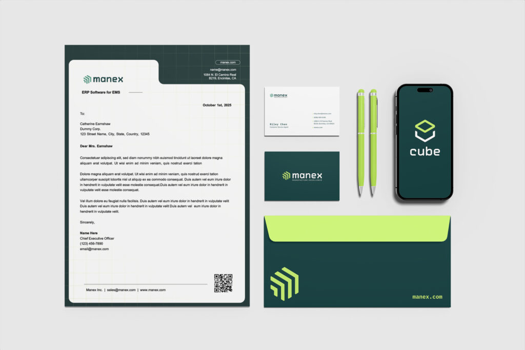
A brand identity system
A logo is one element in a visual system. Strong brand hierarchy defines how the logo, typography, color, imagery, and supporting elements relate to each other and in what order they communicate across different contexts. A business card, a billboard, and an Instagram post all require different expressions of the same hierarchy.
Without that system, a brand feels inconsistent. Not because the elements are wrong, but because they haven’t been given a relationship.
How to Evaluate Hierarchy in Your Own Creative
You don’t need design training to assess visual hierarchy. A few simple questions can tell you a lot:
What’s the first thing I see? Is that what you want the viewer to notice first? If not, the hierarchy needs adjusting.
Can I understand what this is communicating in three seconds? If you have to work to extract the message, the hierarchy isn’t doing its job.
Does my eye know where to go next? Strong hierarchy creates a natural reading path. If you feel stuck or find yourself searching for the next element, something is competing when it shouldn’t be.
Is anything fighting for attention that shouldn’t be? Brand elements, decorative details, and supporting text should play a supporting role, not compete with the primary message.
These questions shift feedback from subjective preference (“I don’t love it”) to structural observation (“the subhead is reading at the same weight as the headline, which is making the page hard to scan”). That’s a conversation a designer can actually work with.
Why Strong Hierarchy Is a Strategic Advantage
In a world where people are consuming more content faster than ever, the brands that communicate clearly and quickly have a structural advantage. Visual hierarchy is how you achieve that clarity at speed.
It’s also cumulative. When hierarchy is consistent across your website, ads, social content, and collateral, your brand becomes easier to recognize and easier to trust. Viewers don’t have to reorient every time they encounter you. The visual language is familiar, and familiarity builds credibility.
This is why hierarchy isn’t just a design consideration. It’s a brand strategy decision.
Final Thought: The Best Hierarchy Is the One You Don’t Notice
When visual hierarchy is working, it’s invisible. Viewers move through the design effortlessly, absorb the message naturally, and take the intended action without friction. They don’t think about why it worked. They just respond to it.
That invisibility is the goal. It means the design is serving the communication, not the other way around.
And that’s what separates creative that looks good from creative that actually does something.
Want to know if your brand’s visual system is working as hard as it should?


