 Skip to content
 SUCCESSES > EQUILIBRIUM ACUPUNCTURE
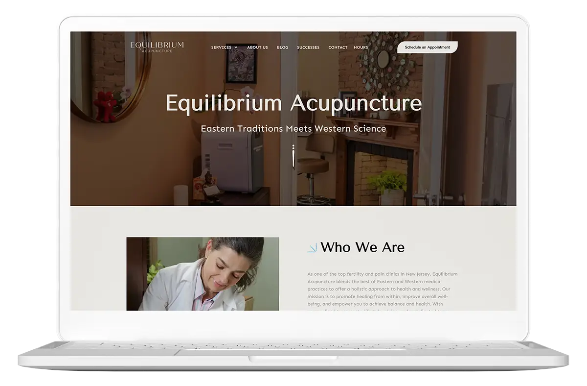
Equilibrium Acupuncture had a clear mission: bring together the best of Eastern tradition and Western science to deliver real healing. But its digital presence didn’t reflect that harmony—or the results it consistently delivered in fertility, pain relief, and whole-person wellness. GreaterThan partnered with the practice to craft a visual identity and website that reflected its expertise, credibility, and calm authority—while helping attract the right patients and grow the practice.
Health & Services

THE STRATEGY
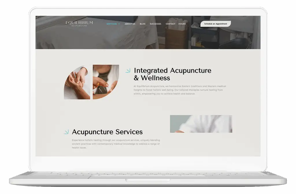
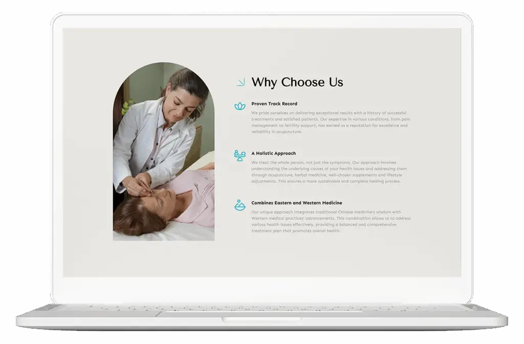
We anchored the brand around what truly made it different: a proven track record, deep integrative knowledge, and a gentle, personal approach that empowers healing on all levels. Through close collaboration with the founder, we developed brand messaging that reflected this holistic philosophy—balancing science and spirit, education and empathy. We brought it to life across a modern, patient-centered website and brand system built for long-term growth.
Brand Design
We designed a brand identity rooted in the concept of equilibrium—visually expressing balance, flow, and warmth. The logo and color palette are minimal and modern, projecting both professionalism and peace. The typography is clear and calm, avoiding cliché wellness aesthetics while still feeling inviting. Every touchpoint—from favicon to footer—reinforces the blend of clinical credibility and personal care.

Website design
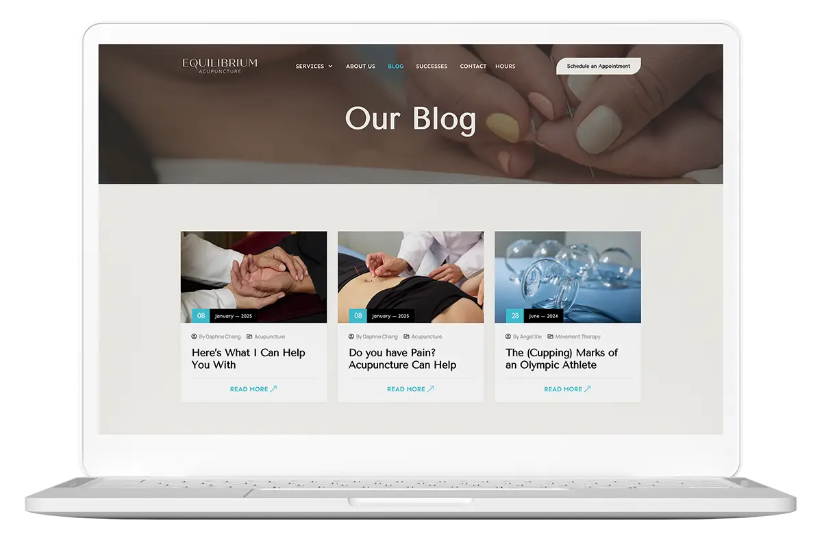
The new website was designed to do more than inform—it needed to instill trust and guide patients through a deeply personal decision. We led with the clinic’s core differentiator: Eastern Tradition Meets Western Science, then supported that promise with success stories, treatment explanations, and credibility markers at every turn. The site featured a comprehensive services section, SEO-optimized blog and FAQ, and a patient-first design with clear CTAs and mobile booking access.


